
After designing Phèdre's marque, the next phase of my painting involves the wall carving in front of Phèdre, where I plan to include a wall carving of Kushiel to ground the temple setting.
But what exactly does the Angel of Punishment look like?
Bronze wings. A haze of red. A whip of fire to punish nations. Kushiel of rod and weal. The Punisher of God never quite gets a detailed description in the series beyond his appearance as a temple statue and the presence Phèdre experiences during her spiritual and physical moments of duress. That's where I get to have a lot of fun as an artist playing around with my own interpretation!
I began by researching how others have rendered Kushiel. There are surprisingly not a lot of fan works involving him. This rendition of Kushiel captures the vibe I get when I read his description. Long haired, dark, beautiful, classical Romanesque clothing, and, of course the three keys to Hell engraved in his belt (Kushiel's symbol as adopted by House Sharizhai):
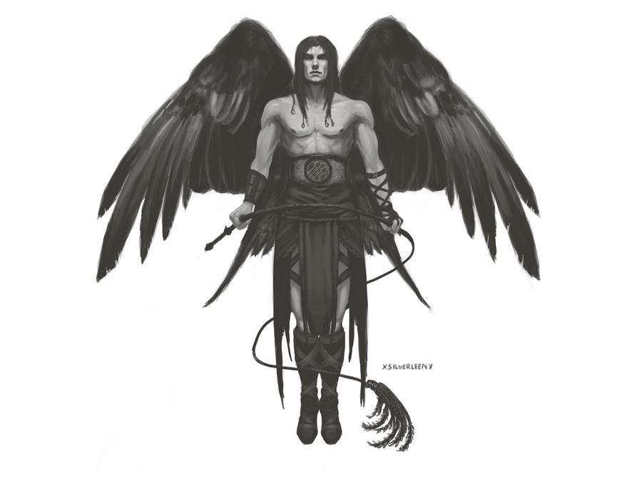 |
| Kushiel Rising by ~XsilverleenX |
I also very much like the idea of Kushiel wearing a bronze mask just as his priests do. The idea of contrasting his angelic nature with his role as a punisher with the donning of a foreboding mask feels right to me.
 |
| Kushiel by *Winneganfake |
 |
| My mood board for Kushiel. More on my Pinterest. |
I let all of the imagery that felt right to me simmer in my brain and arrived at this design for the wall panel:
 |
| You can see a larger version of my three key design here. |
Finally, have a sneak peek at Kushiel as he is in my painting:

I'm halfway done now and hope to share the finished version soon! Till then, feel free to tell me how you envision Kushiel or link to other fan works of him. I'm curious to know how other fans have rendered him!
PS. Did you know that Kushiel was also in an old Shin Megami Tensei (Persona) game?
Take a look at his bizarre design!
Will you give her lashmarks more of a reddish tint? Right now they look more like scars...
ReplyDeleteIt's a stunning piece, I can't wait to see it finished :)
Kirrane, I've been fighting with those weals trying to get them to look fresh. Too fresh and they look too gorey for the intended bookstore placement, too pale and they look like scars.
DeleteHopefully I can strike a balance that is suiting in the finished work, but it's definitely a particular detail I have in mind while I work!
perhaps reduce the shadow on them to give them a less raised appearance? it's beautiful. :)
DeleteGood suggestion, Eliza! I've tried softening the edge and it definitely helps. I'm almost dooone. Can't wait to share with everyone.:)
Delete